Alpro Foundation - Strengthening the brand authority for nutritionists
Alpro Foundation is an organization promoting knowledge of plant-based nutrition among academics and health professionals. Their problem was an outdated, unreadable website that didn't provide the best possible UX. By redesigning its UI and UX, the Dodonut team strengthened Alpro Foundation's authority in nutritionist fields and encouraged new researchers to visit their website.

- Client
- Alpro Foundation
- Type
- Corporate website, Web development
- Industries
- Scientific-based nutrition, health study
- Services
- Project Discovery and Research, UX Wireframes, Usability Testing, UI Design

Project Overview
-
The Client
Alpro Foundation is an independent, non-profit organization that was founded in 1996 in Belgium to promote knowledge of plant-based nutrition, health, and sustainability. Its website provides various resources for academics, health professionals, and students. It supports innovative scientific research by providing grants and awarding young scientists for plant-based nutrition research.
Our mission is to support, promote, share and celebrate credible science-based knowledge and research investigating the impact of plant-based nutrition on human and planetary health.
Alpro Foundation, About Us page
-
Needs
The main goal for the company was to:
- Redesign UI and UX of the website for a fresh look and user-friendly interface,
- Rebuild the website in Jamstack architecture,
- Create a credible and trusted image of a scientific-based, independent organization strengthening its authority in the nutritionist field,
- Improve the user experience of navigation,
- Organize content in a clear and readable way,
- Attract professional academic influencers and new visitors to the website.
-
Problem Statement
The background of the problem
The visual form of the website was unattractive, out-of-date, and in some parts, unclear and unreadable. Some of the features and pages were redundant. The website was run with old technology, which difficulted expansion.
Who was affected?
It caused customers - there were almost no new visitors, and it wasn't easy to build enough credibility and authority.
The impact on the company
The old technology and outdated view on the website didn’t provide the best possible user experience, and impacted the brand's image.
-
Our Role
The primary goal of the Dodonut team was to design a new, user-friendly, and attractive website for desktop and mobile. We achieved that by collecting information from the Alpro Foundation team during the workshop, defining the current needs and expectations, and revising assumptions during the research and discovery.
We were working on:
- UX (user experience) issues,
- Conducting UX research phase with in-depth interviews with stakeholders
- Preparing new sitemap and wireframes,
- The UI visual style of the website and mobile,
- Designing its components for the Bejamas development team,
- Sustainability aspects of the website,
- Implementing WCAG recommendations.
We recommended and provided solutions for the best user experience, sustainability, accessibility, and the most efficient website performance.
-
Project Timeline
The Dodonut team conducted a project design phase for about three months. It included: customer needs research, competitive analysis, working with the customer team on new information architecture, providing different versions of mockups for desktop and mobile, and preparing a design system, documentation, and styleguide.
Phase 1:
Kick-off. Exploring the Problem
-
Kick-off Workshop
We begin every partnership with a kickoff workshop that lets us get to know each other. During the day-long workshop with Alpro Foundation representatives, we discuss the core values and issues using tools like Team Canvas, Lean Canvas, and Personas. Thanks to them, we examined the company's background, the expectations of leading teams, and what we wanted to achieve by redesigning and redeveloping the website. We also discussed the previous site map, revised its information architecture, and worked on the new, more clear, and functional one.
During the workshop, we defined these critical problems:
- More attractive layout,
- Redesigning the menu and making it easier to navigate,
- Emphasizing authority and trust in the organization,
- Reorganization of the articles page and its features,
- Sustainability possibilities and recommendations for the new website,
- Optimizing mobile user experience.
We also discussed Alpro Foundation's competitors and defined the company's unique value proposition.
Phase 2:
Discovery & Research
In the discovery and research phase, we spoke with stakeholders to gain more context about the specificity of this scientific-based nutrition industry and understand what their users' needs are, and how they're currently being met. We also discovered competitors, revised old information architecture and proposed a new one.
-
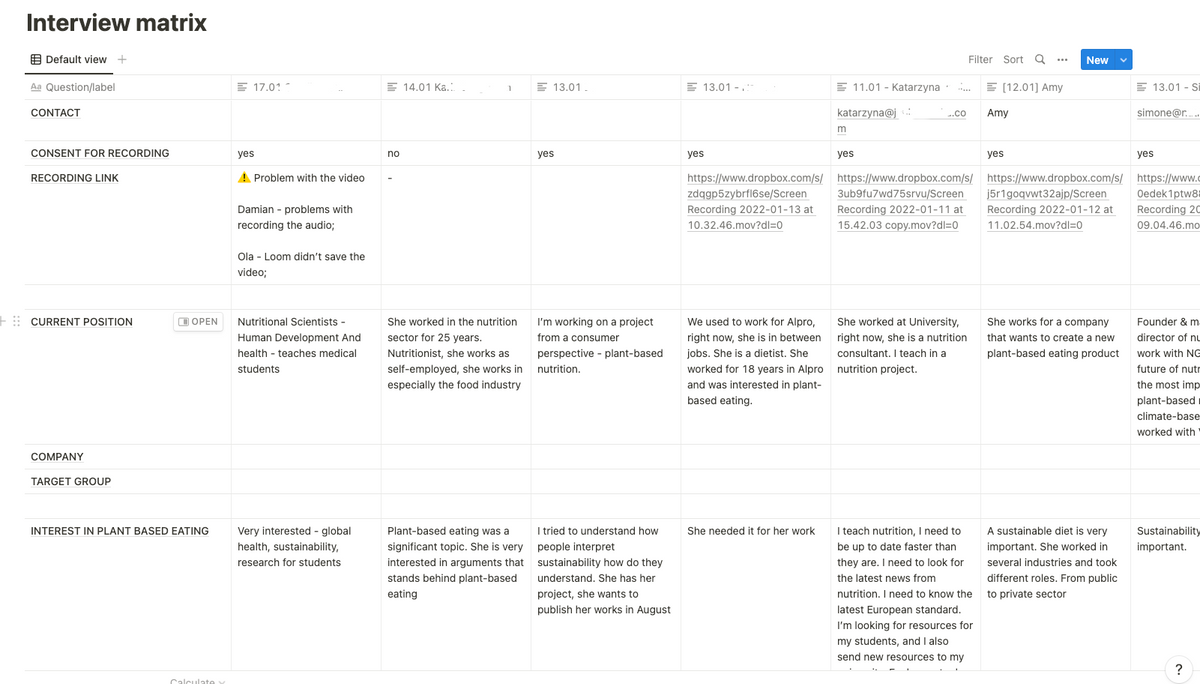
Interviews with stakeholders
Meeting with stakeholders and gathering feedback allowed us to define the project scope.
-
Project scope
The main idea was to change the design and navigation of the website to be more user-friendly and help find valuable information, research-based articles, grants, and events for professionals quickly and easily. It was crucial to focus on how articles and research were presented on their pages. Together with the team, we had to figure out more engaging user interaction methods through articles pages, sharing, newsletters, and contact with the organization. We also needed to organize the menu better so the user would have access everywhere within two clicks. It was also essential to focus on improving the mobile experience.
-
Competitive analysis
After consulting the client's list, we compared several competitors' websites. We mainly focused on their user experience and information architecture — how they organized the menu and navigation. We analyzed their visual form, extracted their advantages and disadvantages, and compared their features. This analysis allowed us to define that we have to focus on a clear message about Alpro Foundation, use less primary color to highlight the most crucial website elements and CTA, and concentrate on numbers that will support the institution's scientific approach.
-
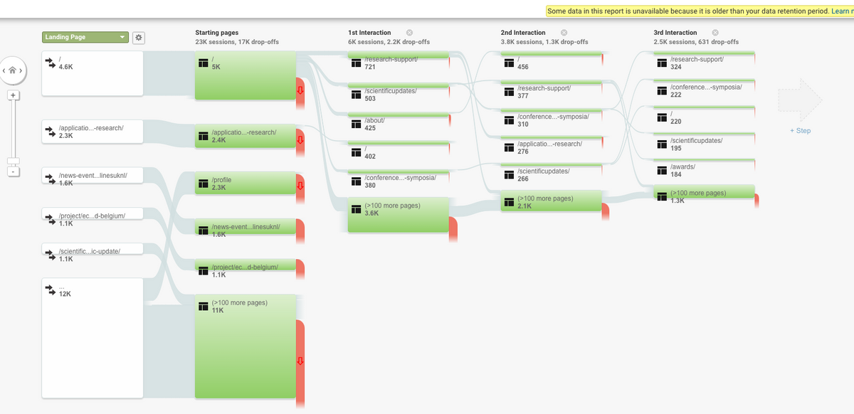
Google Analytics
Analytics helped us understand where on the previous page the problem with drop-off occurs and what the primary source of visitors coming, and from where is the most effective conversion. We discovered the most popular pages and categories for visitors. Thanks to it, we could assume that users don’t understand the communication on the homepage.
-
Target users
The Alpro Foundations is the scientific platform for dietary professionals. Therefore their primary users are scientists, academics, researchers, and students. Through Google Analytics, we also found out that the dominating group of Alpro Foundation visitors are women (66,6%), and the most popular age group of users is 25-34. Still, more than 20% of users who visit the page are 40+, which gave us the impulse to be especially cautious about accessibility requirements.
-
A New Sitemap
The design process began with an analysis of the current architecture, revising it, and creating a sitemap that would structure the information on the website. We like to use tried-and-true solutions, so we borrowed some elements from the old IA (information architecture), which we updated with new labels and navigation to communicate more precisely with scientists and researchers.
Phase 3:
Wireframes
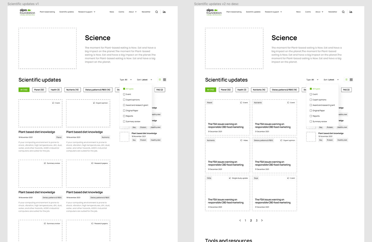
Before we started to design wireframes, we interviewed stakeholders. Their feedback allowed us to create the first wireframes. With Figma tools, we prepared three iterations of wireframes. Thanks to them, we developed:
- a few versions of scientific update
- grant and research pages
- we tested the menu (a few versions of the mega menu)
- two layouts for authors
The first version had a few pages for ‘About us.’ Later we decided to keep everything on one page. We tested two approaches for the ‘Research’ page: one was a long landing page, and another was split into several pages accessible from the main navigation.
Phase 4:
Usability Test and Ideation
-
Assumptions revision through in-depth interviews
Because we had a few questions about proposing an appropriate information architecture, we conducted in-depth interviews to validate assumptions. We wanted to learn from respondents, for instance:
- how people understand grants and awards
- how communicate scientific updates
- what is the difference between scientific updates vs. news
- which layout and UI works best for the user
- how to apply for grants
- what is essential for users.
We proposed in-depth interviews combined with usability testing. For this purpose, we created a clickable desktop prototype. From stakeholders' knowledge, we know that we have two main target groups in the Alpro Foundation case: students and general nutritionists who focus primarily on recent news.
Researchers were looking for grants and programs for their studies. That's why we prepared two script scenarios iterated by all stakeholders. Alpro Foundation recruited people for the in-depth interviews. One of the leading researchers responsible for this phase was Morag Reavley from MyNutriWeb. Bejamas team took part in these interviews as viewers. To talk with respondents, we used Google Meets and sometimes Zoom.
To summarize, we talked to eight respondents: nutritionists, researchers, students, and people interested in plant-based diets. We asked them about their background, how they search for knowledge about plant-based diets, what the most crucial research resources are for them and how they search for grants.
We then sent them the link to the Figma file with a clickable desktop prototype in the Usability Testing part. We asked them to do several tasks and share their general impressions, thoughts, and ideas to improve and develop the interface and navigation later.
Thanks to the insights gathered in the in-depth interviews phase, we could apply main improvements to wireframes:
- We changed the way how we display scientific updates and grants,
- We adjusted the copy (we tested a few variants during the tests),
- We emphasized sustainability and scientific independence by highlighting scientific board and research gates profiles,
- We understood the way how people from the nutritional fields work - that's why we also gave an option to download an article as a pdf that can be used as an attachment to their research works,
- We unified similar sections, and we merged a few solutions.
After the interviews, we had to do the reestimation. After that, we split the project into two parts: MVP and the rest. That's why we picked the most important pages that should be ready for launch.
Phase 5:
UI Design
We received a brand book from Alpro that was a guide to keeping the organization's core vibe while making it look fresh. Once we agreed on the wireframes, we started our visual design process.
-
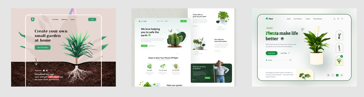
Moodboard
We collected several visual inspirations from websites relating to plants and environmental-friendly organizations and checked their layouts carefully. Thanks to them, we created a moodboard that pointed toward the most popular solutions and visions that work together to create an image of the institution as plant-based, aware, and scientifically reliable.
-
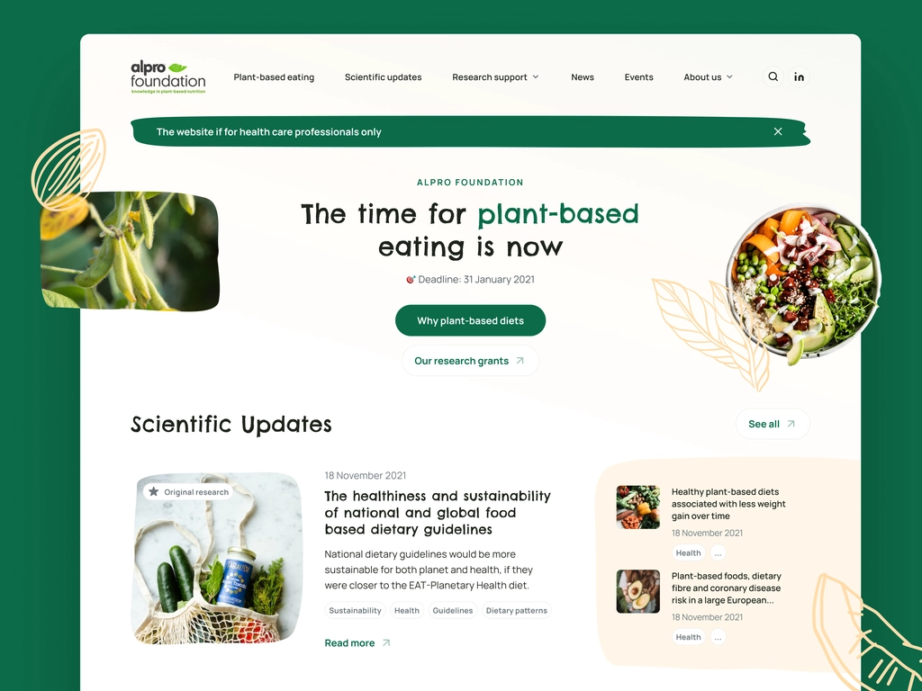
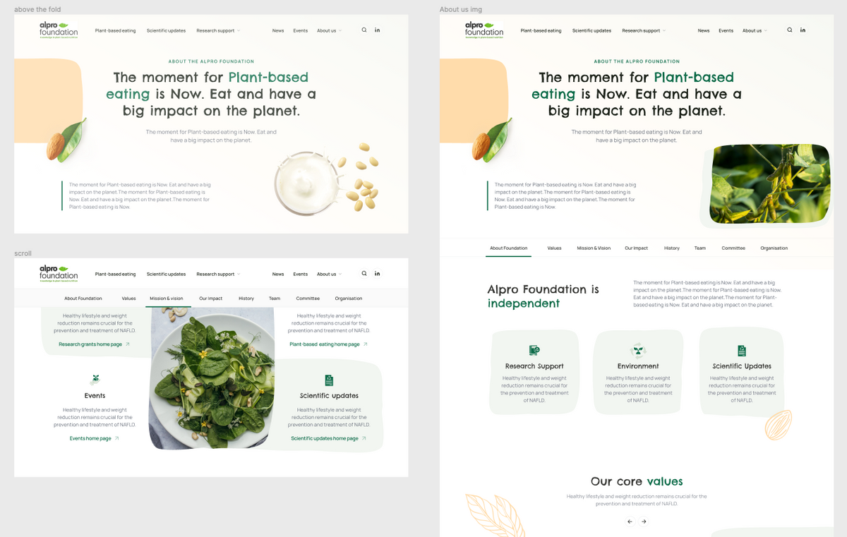
Homepage and About Us
As the first pages, we designed 'About Us' and the Homepage. We prepared three UI versions for them.
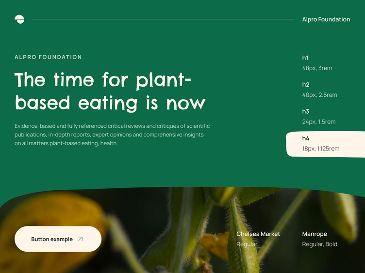
- We prepared six variants of fonts, so we quickly compared what works best with the brand's layout and image. Finally, we picked typography and decided on the free font from Google Font Chelsea Market. It has a bohemian, hand-written style and resembles a blackboard text. It represents a very fresh and modern approach. For the text body and other components, we chose Manrope sans-serif font that makes the content and the website feel light and legible.
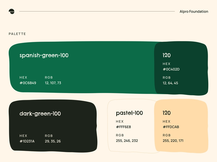
- We adjusted the color palette for the digital experience. We designed a clear, white background site with much white space to focus visitors more on the written content and make a clear, uncluttered view. Moreover, we discovered that the light green from the Alpro Foundation logo, especially on button components, doesn't support WCAG AA requirements. That's why we adjusted palette colors to be more accessible but remain green. Through this process, we achieved better contrast.
- Finally, we picked new photos, illustrations, and shapes. We decided to combine pictures from version 2 and forms from version 3. We also feel that colors from v2 are better. But all stakeholders agreed that it was a great start. Pictures represented growing and blooming plants, soy grains, and healthy, colorful, veggie food. We combined those images, pastel color rectangular, uneven shapes with rounded corners and transparent, outlined illustrations of leaves, nuts, and grains.
- Later, we prepared the rest of the pages and iterated the design when we received a copy. In the end, we had four iterations on UI to deliver the final sections.
- In the end, we also prepared a newsletter and image templates.
-
All screens optimization
When the company decided which design we would implement, we started to design it for all screens. We focused mainly on the desktop, while more than 87% of visitors visit the desktop website. Still, we also prepared mobile optimization to make the institution's content readable, user-friendly, and attractive.
-
Documentation and Styleguide
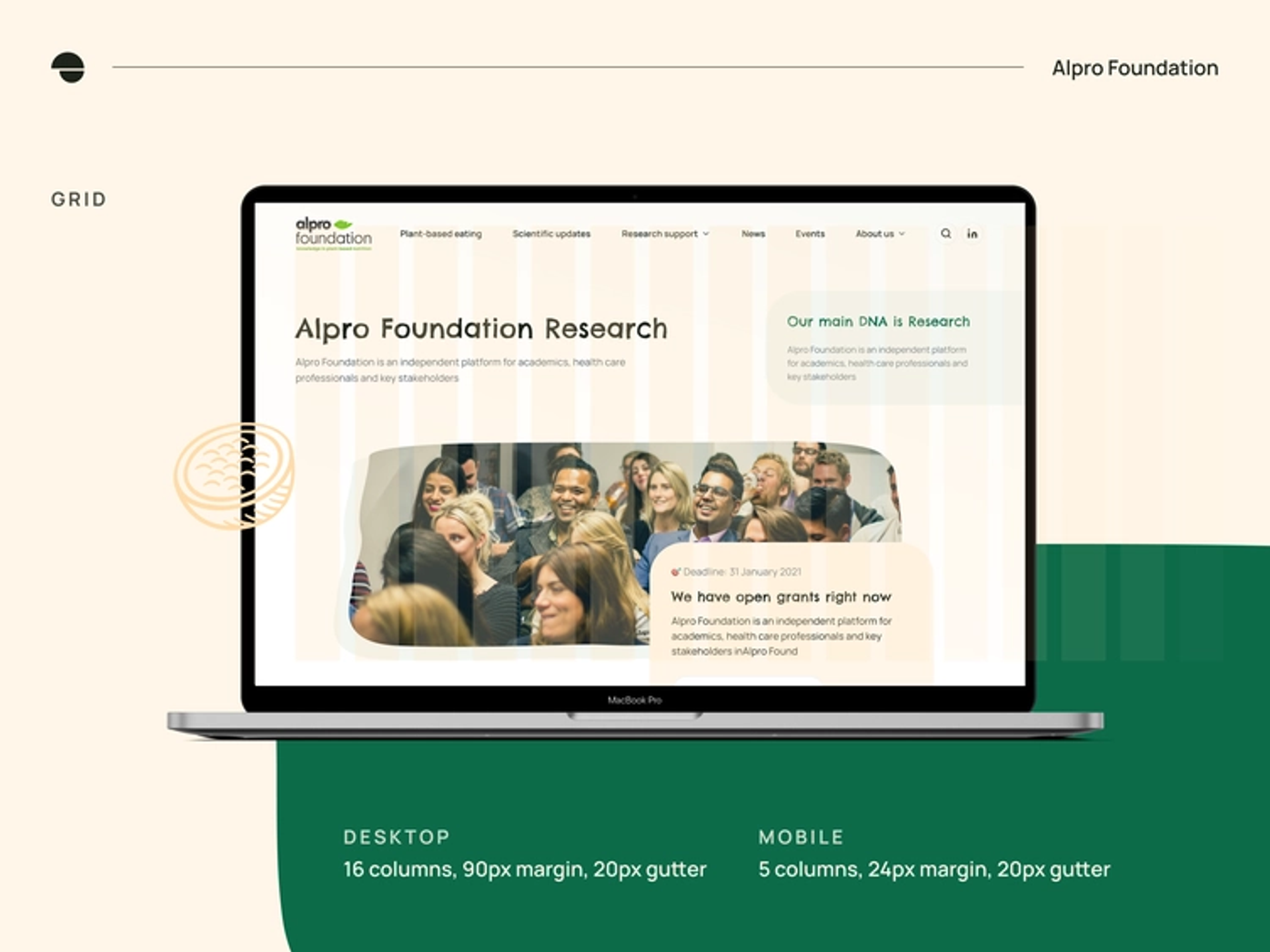
As the last step, we created a styleguide for the Alpro Foundations website for desktop and mobile. It covered all components and their different states: buttons, fonts, icons, tags, form inputs, and colors. Moreover, documentation included descriptions of the chosen grid system, margins, paddings, containers, and headings.
-
WCAG
For Alpro Foundation's website, we implemented AA criteria level of the accessibility requirements included in WCAG. We used at least a 16pt font size for the content, but the desktop body text dominates even 18pt. We checked and adjusted the contrast ratio to make the website components visible to all users.
Phase 6:
Techstack
The information about the development phase will be soon published as a case study on the Bejamas website.
Sustainability
We consider sustainability to be an essential factor in every project we undertake. We aim to ensure that our website addresses the needs of both our clients and our environment. Therefore we are twice happy when we see that sustainability is an important goal of our client, too, as it was on the new Alpro Foundation website.
During this design phase, we checked what is possible from the sustainability side of this project, and finally, we achieved it through several steps:
- We use easy and weighing little shapes, illustrations and images, mostly in SVG format,
- We created simpler information architecture - most pages are accessible from the mega menu or footer just in two clicks,
- We determined a font budget,
- We were aware of colors, so we avoided using blue, the most consuming color. We also adjusted colors due to accessibility.
- We avoided video - we could use it, but we decided to go without it. The page and content still look and work pretty well, so it was redundant.
- We stand that less JS helps to achieve more sustainable design. Therefore we resigned from all the carousels across the services.
- Image optimization - even though we use many images, we made them smaller than we usually do. Even 10% smaller images decrease the website page weight significantly.
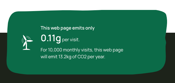
To summarize, we achieved excellent results on the new Alpro Foundation website showing that every homepage visit emits 0.23g of CO2, but on the other pages, it emits even less.
Key takeaways and conclusion
As the final product, we created the High Fidelity Prototype for the desktop and mobile. The MVP website version was implemented quickly, and the rest is in the development phase. Through several iterations, we found the perfect solutions for the new design of the Alpro Foundation website that shows the organization's scientific approach, emphasizing its credibility and trustworthiness in the independent research they conduct and promote.
Thanks to appealing visual form, new functionalities, and deep research about the specificity of a nutritionist and academic field, we helped resolve previous challenges. We encouraged professionals to visit their web and its content and to use the organization's offer of valuable knowledge articles and supporting grants.
We were really impressed with the work. Dodonut understands what it takes to deliver a modern, future proof website that meets both the business’ and the users’ needs and requirements. And the fact that the final result ends up looking absolutely stunning is no coincidence either!
Team:
Lead Designer - Tomasz Osowski
UX/UI Designer - Damian Bednarz
Team Leader - Gracjan Opiela
Front-End Developer - Marcel Bednarz, Gerald Martinez
Project Manager: Magdalena Radzikowska, Emanuel Radoi
QA Team - Aleksandra Gontarz, Wojciech Świderski